
Head of Ruby Development at ASSIST
„Nothing is too small to know and nothing too big to attempt.” - William Cornelius Van Horne
Read time: 15 minutes
Introduction
Nowadays many web applications have the possibility to save and display data in a portable format. In Python/Django applications we have the possibility to display data in a web page, but also save it in such a format. Official Django documentation contains a basic tutorial about saving data in PDF (Portable Document Format).
First of all, in order to use this library you need to install it. You can install it using pip or easy_install by typing: pip install reportlab or easy_install reportab in your virtual environment. It's fully recommended to use a virtual environment for each of your projects especially if you work on many projects and each of them use different versions of libraries. For example in this application, which is also available on GitHub, we use these libraries:
- Django==1.8.2
- Pillow==2.8.2
- reportlab==3.2.0
In a previous article, the main subject was How to export excel files in a Python/Django application, whereas this article will show you how to export PDF files. This application will extend the one in the previous article; as a recap, the application saves weather data for multiple towns. A user can add different data for weather using the administration interface provided by Django. The home page of application displays today's weather for different towns. The main menu also contains a link to the list of all towns and a link to weather history, which is a page where the user can filter weather history by town and can generate both Excel or PDF files reports.
How to serve the file for download
In order to download the data written in a file format, we can use two buttons on the HTML page, one for Excel and one for PDF. Each of the buttons have an associated name:
Forwarding in the corresponding view we have to check if the button name exists in the request. If it does then we create a HttpResponse object with the corresponding content. Afterwards we have to set the content_type to be “application/pdf”, the Content-Disposition to be an attachment, add a name for filename and the corresponding file type, in our case PDF. This will tell the browser to treat this HttpResponse object as an attachment of pdf type.
if 'pdf' in request.POST:
            response = HttpResponse(content_type='application/pdf')
            today = date.today()
            filename = 'pdf_demo' + today.strftime('%Y-%m-%d')
            response['Content-Disposition'] = 'attachement; filename={0}.pdf'.format(filename)
            buffer = BytesIO()
            report = PdfPrint(buffer, 'A4')
            pdf = report.report(weather_period, 'Weather statistics data')
            response.write(pdf)
            return response
We use a buffer which contains the PDF data. For this we can use BytesIO class that represents a stream implementation using an in-memory bytes buffer. For the filename we created a filename variable by joining a string and current date.
How to create a PDF document
In order to be as modular as possible we’ve created a class named PdfPrint that contains several methods for creating different elements. This class has an __init__ method with two parameters: buffer and pagesize. Buffer is used to hold data and pagesize is used to set page type and it's width and height. ReportLab has a series of build-in types: A0 to A6, B0 to B6 and letter type, A4 being the default format if we don't give one. Also you have the possibility to set your own page size by providing custom height and width.
    def __init__(self, buffer, pageSize):
        self.buffer = buffer
        # default format is A4
        if pageSize == 'A4':
            self.pageSize = A4
        elif pageSize == 'Letter':
            self.pageSize = letter
        self.width, self.height = self.pageSize
The lowest level interface used to generate PDF files is Canvas. Canvas can be seen as a white paper where you can “draw” elements like text, images or other graphics elements.
In order to create more complex documents we need to use Platypus (Page Layout and Typography Using Scripts), a high level layout library of ReportLab. Platypus has several layers: DocTemplates, PageTemplates, Frames, Flowables and Canvas. DocTemplates and PageTemplates are used to set document specifications layout. Flowables it is used to wrap, draw or split text or graphics elements in the document. Main flowables used to draw text elements are Paragraph, Spacer and Table. In the next parts of this article we will try to explain how to add such elements in a PDF file.
For the PDF template pages we used SimpleDocTemplate class, a special case document template that can handle multiple simple documents. The code presented bellow is used to set document characteristics (set the margins and the page size). After setting document characteristics, we've created a list used to add flowable elements. At this point we only add title to this list.
    def report(self, weather_history, title):
        # set some characteristics for pdf document
        doc = SimpleDocTemplate(
            self.buffer,
            rightMargin=72,
            leftMargin=72,
            topMargin=30,
            bottomMargin=72,
            pagesize=self.pageSize)
        styles = getSampleStyleSheet()
        # create document
        data = []
        data.append(Paragraph(title, styles['Title']))
        # create other flowables
        doc.build(data)
        pdf = self.buffer.getvalue()
        self.buffer.close()
        return pdf
How to add paragraphs and spaces in between
This section shows you how to add some paragraphs to the document. In order to do this we first need to use a certain style for the paragraph. ReportLab library comes with a set of predefined styles such as: Title, Heading1 to Heading6, Italic, Normal, etc. In order to use these styles we need to use this function getSampleStyleSheet:
styles = getSampleStyleSheet()
But we can also add our custom text style. To do this we can use the ParagraphStyle class.
styles.add(ParagraphStyle( name="ParagraphTitle", fontSize=11, alignment=TA_JUSTIFY, fontName="FreeSansBold"))
This class construction method has several parameters, most used parameters are:
- name - the name of the new style
- fontSize – the dimension of the new style
- alignment – the style alignment, it can be: TA_JUSTIFY, TA_CENTER, TA_LEFT or TA_RIGHT
- fontName – you can use 14 predefined fonts offered by ReportLab or you can define your own one
To use other fonts than the predefined ones you need to add the specific TTF font file in the static folder. Afterwards you need to register that font like this:
pdfmetrics.registerFont(TTFont('FreeSans', settings.STATIC_ROOT+'FreeSans.ttf'))
This feature offered by ReportLab library is very important, especially if you need to write in a language that uses special characters, others than the ones in English.
After setting your custom paragraph styles it is time to use it. In order to do this, simply create an empty list and add to it any element that you want on your document. To add a paragraph in your document use Paragraph class by instantiating an object with the text you want to appear and the paragraph style.
Paragraph('Paragraph example', styles['Title'])
But, between paragraphs or other elements there should be empty spaces. To do this ReportLab library came with a specific class called Spacer. So in order to create custom spaces between document elements we can use this method by adding it as an element on the page Spacer(width, height).
Usually a PDF document can contain more than paragraphs, for example, we may want to add a table. This library came with specific classes for adding tables, you can find out more about that in the next section.
How to add a table
Another important flowable element of ReportLab library is represented by tables. The class used to draw a table into a document is named Table. The __init__ method for this class has one mandatory parameter: a list with table data including the table header. It can also have optional parameters used to customize rows and columns: colsWidths or rowHeights. Official ReportLab library documentation tells us that “a cell table can contain anything that can be converted to string or flowable”.
In order to set some custom specifications for our table we can use TableStyle class. To customize our table we call setStyle function with an TableStyle object as parameter. This class came with a list of tuple commands, each of the tuples being represented like this:
- first element is the attached name;
- second and third are coordinates for starting and stopping points for the cells that will be affected;
- other options like color or thickness.
In our example INNERGRID and BOX are used to set the black color and thickness of 0.25 for the cell lines, VALIGN and BACKGROUND are used to set the text alignment and background color for the table header only.
        wh_table.setStyle(TableStyle(
            [('INNERGRID', (0, 0), (-1, -1), 0.25, colors.black),
             ('BOX', (0, 0), (-1, -1), 0.5, colors.black),
             ('VALIGN', (0, 0), (-1, 0), 'MIDDLE'),
             ('BACKGROUND', (0, 0), (-1, 0), colors.gray)]))
After setting the style for our table we need to add it into the document like any ordinary flowable element by calling append function with table name as parameter.

In other projects we may need to show data in a more friendly and easy way to visualize it, other than displaying it in a table. For this we need to create charts based on that data.
How to add charts in PDF documents
ReportLab library offers support to add some other graphics elements like charts. The library can be used to generate different types of charts like line, bar or pie charts. In order to create a chart first we need to create a drawing area by instantiating a Drawing object. Next we need to draw the chart into this area: d = Drawing(0, 170).
For all our charts we've created other two methods to set chart title and chart legend. The method used to “draw” the chart title creates a Label object and sets a specific font, size and position for it.
chart_title = Label()
        chart_title.fontName = 'FreeSansBold'
        chart_title.fontSize = 16
        chart_title.textAnchor = 'middle'
The second method used, called legend_draw has two mandatory parameters: legend labels, a chart object and also **kwargs in order to provide an arbitrary number of custom arguments for each type of chart.
Firstly, we need to create a Legend object and afterwards set some characteristics for it, beginning with the start position point and labels alignment.
  legend = Legend()
  legend.x = kwargs['x']
  legend.y = kwargs['y']
  legend.alignment = 'right'
Other characteristics that can be set for the legend:
- boxAnchor – sets anchor point for the legend area
legend.boxAnchor = kwargs['boxAnchor']
- columnMaximum – sets the maximum number of items included in one column
legend.columnMaximum = kwargs['columnMaximum']
- deltax – sets the distance between neighbouring items
legend.deltax = 0
- colorNamePairs – creates a list of color/item name tuples using zip function
legend.colorNamePairs = zip(lcolors, labels)
Next using enumerate python feature we set the interior colors of the plot area according to the specific chart:
        for i, color in enumerate(lcolors):
            if chart_type == 'line':
                chart.lines[i].fillColor = color
            elif chart_type == 'pie':
                chart.slices[i].fillColor = color
            elif chart_type == 'bar':
                chart.bars[i].fillColor = color
Because we need to serve data into a certain format I have created some other functions in a file called utils.py. I've also created a function that generates random colors for the bar and pie charts.
a. How to add line charts
In our example we want to add a line chart that will display the data from a period of time with the minimum and maximum registered temperatures. The library came with some classes used to create line charts like AbstractLineChart, LineChart, HorizontalLineChart, HorizontalLineChart3D or SampleHorizontalLineChart. We use the SampleHorizontalLineChart which offers many simple methods to create a line chart.
chart = SampleHorizontalLineChart()
After creating the chart object, it is time to set some custom properties: width, height and some other characteristics for our chart:
- data – the displayed data, it's format being a list of tuples
chart.data = values
- lineLabels.fontName – sets the desired font for data lines
chart.lineLabels.fontName = 'FreeSans'
- strokeColor and fillColor - sets colors for the plot area border and interior area
chart.strokeColor = colors.white
chart.fillColor = colors.lightblue
These parameters can also set attributes for lines; color and line width:
chart.lines[0].strokeColor = colors.red
chart.lines[0].strokeWidth = 2
- lines.symbol - sets markers for points, you can chose from a list of markers types: Square, Circle, Diamond, StarFive, Triangle, Pentagon, StarSix, Heptagon, Octagon, Cross or even other symbols like UK_Flag
chart.lines.symbol = makeMarker('Square')
- lineLabelFormat – sets the format used for the points displayed in the plot
chart.lineLabelFormat = '%2.0f'
- joinAxisMode – this attribute is used to set the intersecting point for the axes
chart.categoryAxis.joinAxisMode = 'bottom'
- labels – this attributes can be used to set some characteristic for axes labels like:
-
fontName – sets font
-
angle – sets text inclination
-
boxAnchor – sets label position
-
chart.categoryAxis.labels.fontName = 'FreeSans'
chart.categoryAxis.labels.angle = 45
chart.categoryAxis.labels.boxAnchor = 'e'
- categoryNames – sets labels for X axis
chart.categoryAxis.categoryNames = days
- labelTextFormat – sets the format displayed for Y axis
chart.valueAxis.labelTextFormat = '%2.0f °C'
- valueStep – sets the steps for Y axis
chart.valueAxis.valueStep = 10
And here is the result of setting all those characteristics:
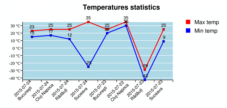
You should know that this data is not real and I chose to add some negative values for temperatures only to show how you can set some characteristics for line charts.
b. How to add bar charts
Another chart type used to display data in a schematic mode is bar chart. ReportLab library comes with several types of bar charts: BarChart3D, HorizontalBarChart, HorizontalBarChart3D, VerticalBarChart or VerticalBarChart3D. In our example we used VerticalBarChart to display the wind speed statistic for all towns for a frame of time.
Firstly we create an VerticalBarChart object bc = VerticalBarChart() and subsequently we can set characteristics for this object. The characteristics that we can set are:
- width
- height
- data - list or lists of numbers
- barSpacing – sets the bar width between bars
bc.barSpacing = 0.5
- labels – sets some characteristics for the labels that appear in the X axis. In our example we set the position
bc.categoryAxis.labels.dx = 8
bc.categoryAxis.labels.dy = -2
- categoryNames – sets the names displayed on the X axis
bc.categoryAxis.categoryNames = days
- barLabelFormat – sets the label format for the bars
bc.barLabelFormat = '%d'
- barLabels – sets some characteristics for the bar charts; we used nudge that sets distance between top of a bar and it's label
bc.barLabels.nudge = 7
- valueAxis – sets the characteristics for the Y axis, for example
- labelTextFormat – to set the labels format
- valueMin - to set the minimum value for the Y axis
bc.valueAxis.labelTextFormat = '%d km/h'
bc.valueAxis.valueMin = 0
After setting all these characteristics we can see the result:

c. How to add pie charts
There are some projects where you need to display data that is linked. Each piece of data represents a proportional or percentage part of the total. Therefore, the best approach for this is representing it by pie charts. ReportLab library came with several classes that can be used to create pie charts: Pie, LegendedPie, Doughnut and Pie3d
In our example we want to create a pie chart that will show a statistic regarding the percentage of the precipitation probability. We divided the precipitation probability in five categories: between 0-20, 21-40, 41-60, 61-80 and 81-100 percentage. We used the Pie class to create our chart, for this we set the x and y coordinates and some other characteristics:
        pc = Pie()
        pc.x = 0
        pc.y = 50
- data – sets the data for the chart (list of numbers)
pc.data = values
- sideLabels – adds a line that link the label and it's specific slice
pc.sideLabels = 1
- slices – sets some characteristics for the component slices, for example:
- strokeWidth – sets the width of line between slices
-
strokeColor – sets the line color
pc.slices.strokeWidth = 0
pc.slices.strokeColor = None
After setting these characteristics to our pie, it is time to see the result:

How to add page numbers to a PDF document
In some cases when your documents have more than one page you can add numbering. In order to apply numbering on the document pages we've created a method that will draw the numbers on the each page of document. To get the number of current page we used getPageNumber method that returns the page number for each page being generated. After we get the number we draw it in the page at a certain position by using the drawCenteredString method that places the given number on the canvas.
    def pageNumber(self, canvas, doc):
        number = canvas.getPageNumber()
        canvas.drawCentredString(100*mm, 15*mm, str(number))
We've used this function when we've called the build function for the SimpleDocTemplate and set the onFirstPage and onLaterPages parameters.
In conclusion
In the end, we can say that ReportLab library represents a very powerful tool. Moreover, I think it is an easier enough tool that can help a developer to create portable documents using Python language and integrate it into a Django project. This article tries to show you how to setup and use some of the features offered by ReportLab library to create PDF files.
You can access the entire source code of this application by accessing GitHub. I hope this article is useful and helps you when need to create and export data into PDF documents in a Python/Django application. If you want to do more than this and create more complex documents or use other options you can access the official ReportLab library documentation.
However, if you need to export your data in other formats, like xls for example, you can check this article: How to export excel files in a python/django application.
→ If you want to find out more about the author of the article click play on the below video.
Subscribe on YouTube