iOS 7 flat redesign highlights
It's been a long road for Apple to arrive with the new iOS 7.
Over the years, from the first version to the iOS 6, things stuck around largely unchanged.
But now, for the first time since its launch, the look and feel of iOS is fundamentally different.
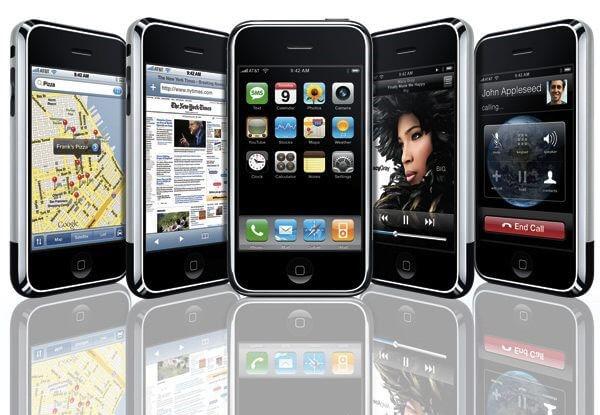
With the lunch of the first iPhone, Apple established the general look and feel of what would become the world's first mature touchscreen-driven mobile operating system.
While iOS 1.0 established the paradigms of Apple's mobile experience, iOS 2 expanded with the addition of the App Store and third-party applications.
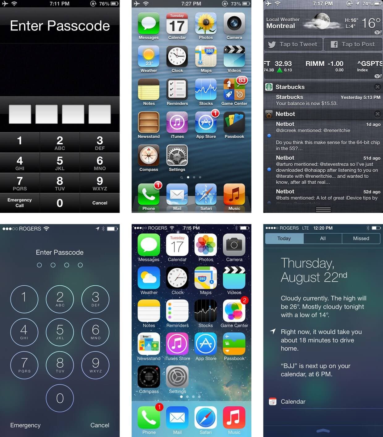
Passing time, iOS 3 is launched making icons look more polished and with the iOS 4 they refined that even more. The interface remained largely the same in the next two versions, Apple embracing the so called ‘skeuomorphism’, or in other words derivative object that retains ornamental design cues from structures that were necessary in the original.
With the new iOS 7 design things look fundamentally different throughout, although it remains familiar.
The look and feel of the new version of iOS is perhaps the most noticeable change. Gone are many of the elements that mimicked real-world counterparts and in their place are simpler, often more colorful elements.
iOS 7 is a complete visual rewrite of the operating system and by that we mean literally every pixel, every screen, every icon redrawn and rethought for the new OS. The results are stunning.
Everywhere you look over the internet you can find that the new iOS implements a "flat design", but what is flat design anyway? Flat design is everything else but no UI elements with shadows, shines, textures and 3D effects. Is a minimalistic approach using simple colors, shapes and icons to create designs that are instantly informative.
Moreover, what really happens is much bigger: Apple is pushing into growing up as smartphone users because we no longer need the skeuomorphism or all of the borders and buttons that helped guide in using first couple of smartphones.
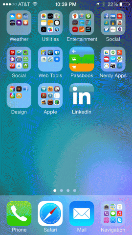
Lots of these changes are meant to help you quickly navigate the system, because nowadays users just want to have access to desired content as fast as possible. If something is not understand what it does, it will be learned fast.
Everything is minimalistic and beautiful, driven by "clarity, translucency and depth", as Apple defines iOS 7.
Depth is handled by the new physics and particle engine. The entire interface and experience are built on it. Screens no longer move because someone animates them, they drop and collide and bounce because of behavior ascribed to them. Likewise icons fly and an entire Home screen that shift with your every movement, providing glimpses into what's just below the surface.
Clarity equals minimalism. Let's take buttons as example. They have been simplified so much and taken to that stage where what is unnecessary is ripped off and more than that, code color has a good implementation, meaning that using contrast, users can see the interaction elements.
Second case where clarity is best highlighted is the new text kit, which allows font to dynamically scale not only in size but in weight so type always looks great, and people who want a bigger size for increased legibility can have it.

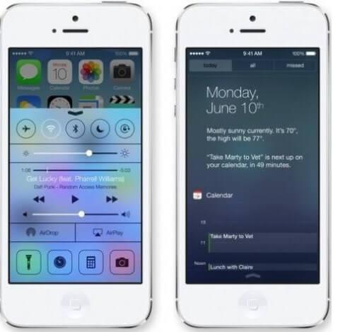
iOS 7 uses translucent layers to place elements that aren't currently in use behind elements that are in use. The new Control Center (pictured down) allows a user, with a simple up swipe, to call up the most commonly used functions from the old Settings. When you do so, the translucent layers leave you with a sense of context, that the main screen is still present, and that you can easily return to it with a down swipe.
The next step has been taken assuming users no longer need to interact with smartphones like PCs, tapping with our fingers in place of a mouse.
With this new makeover, Apple sets new steps for designers and developers, changing the way an application is made. Apple's new OS isn't prettier to use, it's more accessible to build for.
Basically, the new design language makes is simpler to turn a good idea into a first-class application, even without knowing how to bounce fake light off of a button.
We know how a touchscreen works. After all these years, the "training wheels" aren't necessary.
Even if the look and feel of the new iOS it's brand new, after a while of getting used with the new design, you'll notice that under the hood it's still Apple's product, but faster and lighter.
P.S.: And because we love to make top products for our customers including latest trends in design, here's a little sneak peek from a future application: