#Tips for Creating a Purposeful Landing Page in Figma
A landing page plays a very important role in your business. Because it serves as the entry point for your business, you want to make it count right from the beginning.
Users spend on average less than 15 seconds on a website - therefore, content must be displayed in such a way that visitors understand within 4 seconds who you are and what you do.
An important element of a landing page is the “Call to Action” (CTA) button, which aims to guide the user to complete an action we want. For example, look at the hero area of Shopify's landing page - see how your attention is drawn to the purple button on the left? "Start free trial" represents their main CTA.

Why are you creating the landing page in the first place? Maybe you want to attract more leads, increase the sales of your product or increase the number of newsletter opt-ins. It’s up to you, as long as it’s clear.
Decide on your main goal, and make sure all of your decisions are taken with this goal in mind.
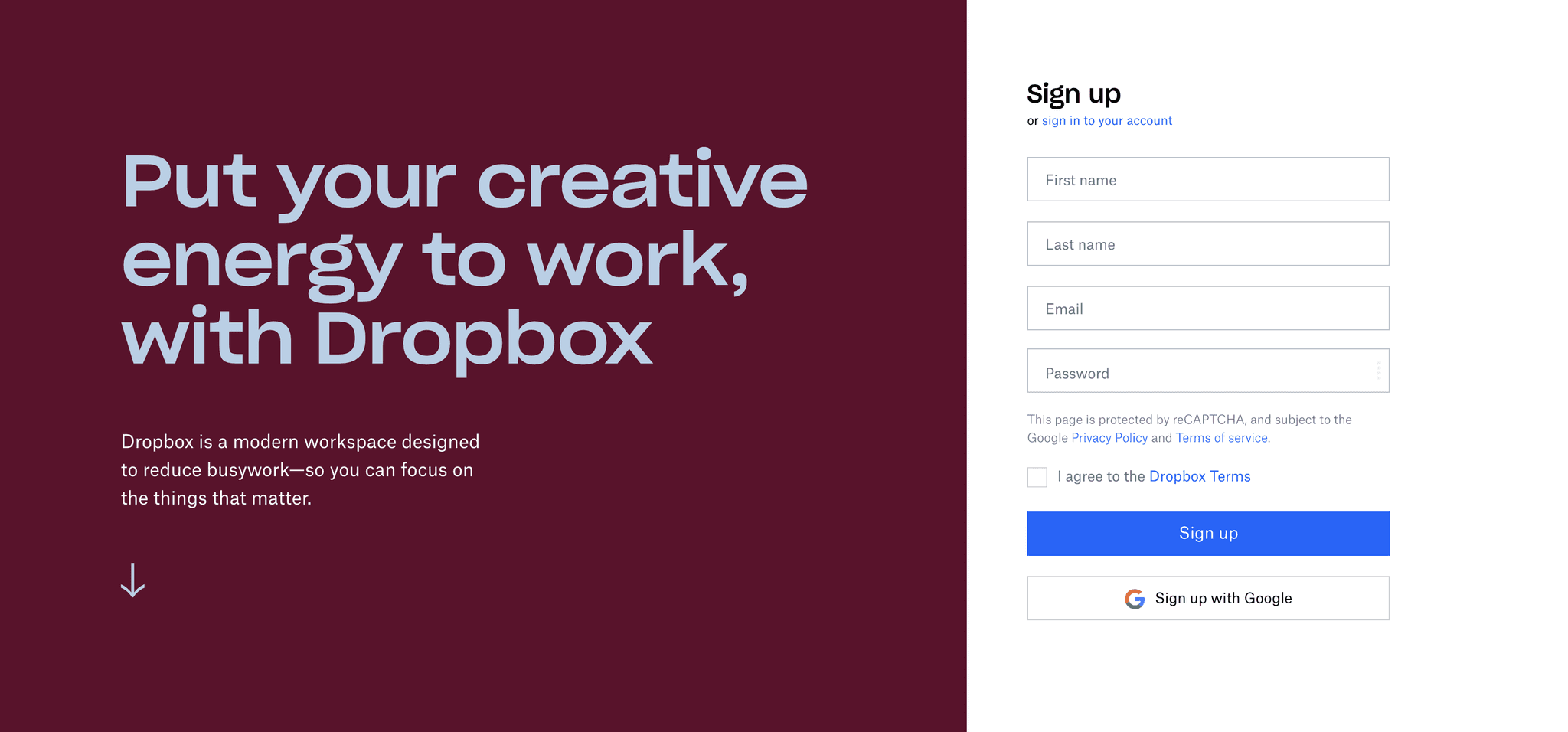
See how Dropbox’s landing page is built? Their main goal is to get people to make an account on their platform soon after they land on the page. The sign-up form is the main thing you see, which is exactly what Dropbox intended.
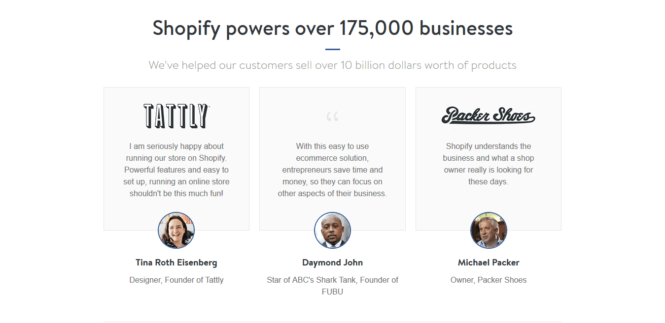
This is a powerful section because as humans, we often seek other people’s confirmation regarding whether a product or service we intend to buy is as good as we thought it was.
For this, you should list some written testimonials from existing customers or a better alternative is to have video ones, so any visitor that has doubts about a product or service can be convinced of its effectiveness.
Often, images can help to convey an idea more effectively. For example, where content is not so obvious for site visitors, you can just insert an image to support your message.
I applied this web design principle in my tutorial, where I used a nice illustration with many of the iconic buildings from London. This was for a landing page of a website where the main purpose was to promote London’s attractions and get users to buy tickets.
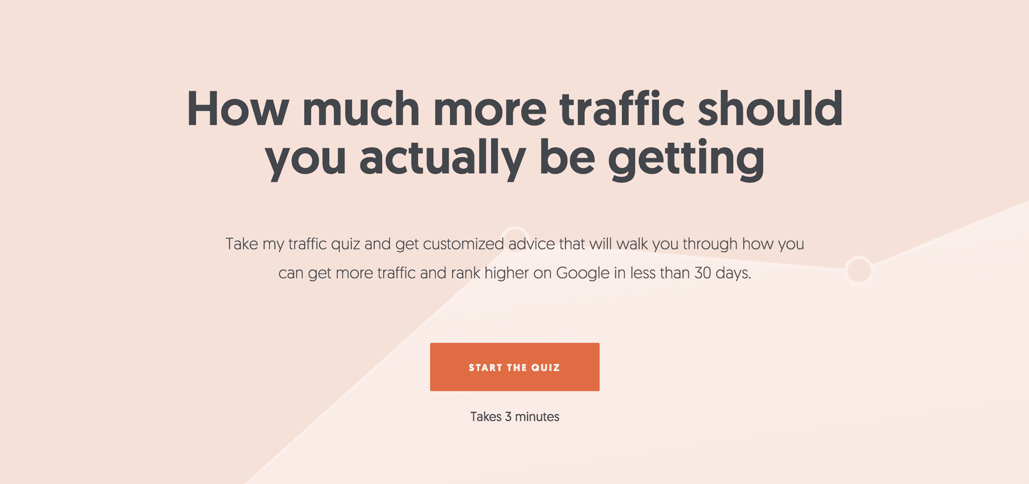
A known fact in web development and advertising is that regardless of whether you are selling a product or a service, you may want to give your potential customers a little gift. For example, you can give a discount voucher or an e-book or a tool to help solve a specific issue related to your product or service. Below is an example of a quiz created by Neil Patel that gives you tailored suggestions on how you can increase the traffic to your website.
Your landing page is where users will land after they've clicked on your ad so it makes sense you should focus on your webpage design. From now on, it’s your choice on how you decide to optimize your landing page and convert those visits into leads and paying customers, but at least now you know a few do’s and dont's to get you started in Figma.
Make sure that you convey your message clearly, you have a well-structured and clean layout, you use search engine optimization techniques and I would recommend just having one Call to Action to guide your visitors to take that one action.