


Head of Front-end Development at ASSIST
"People will kill you over time, and how they'll kill you is with tiny, harmless phrases, like 'be realistic.'" - Dylan Moran
Read time: 9 minutes
Introduction
Writing CSS is easy. Writing good and maintainable CSS is hard as hell. I personally love it and one of my professional goals is to find ways of writing CSS that is modular, maintainable and in the same time easy to understand and worked on by a developer that was not involved in the project from the start. This article is the first in a series that will cover my approaches regarding front-end development. In this one I want to share with you some thoughts about a methodology that I use when writing my CSS, it's called BEM with Sass and I won't lie to you it's quite good.
BEM = Block Element Modifier, is a methodology that helps you to achieve reusable components and code sharing in the front-end. BEM is a simple(not at first sight) naming convention to make our front end code easier to work with and easier to scale.
- BLOCK: Standalone entity that is meaningful on its own.
- ELEMENT: Parts of a block that don't have standalone meaning. They are semantically tied to its block.
- MODIFIER: Flag on blocks or elements. Use them to change the appearance or behaviour.
BEM with Sass - Study of case
As an example let's consider creating a menu.
First let's see the Bootstrap v3 simplified menu example.
<!-- HTML -->
<ul class="nav navbar-nav">
  <li><a href="#">Link 1</a></li>
  <li><a href="#">Link 2</a></li>
  <li><a href="#">Link 3</a></li>
</ul>
/* CSS */
.navbar-nav{ /* ... */ }
.navbar-nav>li { /* ... */ }
.navbar-nav>li>a { /* ... */ }
Using BEM we could do something like this:
<!-- HTML -->
<ul class="c-menu c-menu--horizontal">
  <li class="c-menu__item c-menu__item--first">
    <a href="#" class="c-menu__link">Link 1</a>
  </li>
  <li class="c-menu__item">
    <a href="#" class="c-menu__link">Link 2</a>
  </li>
  <li class="c-menu__item c-menu__item--last">
    <a href="#" class="c-menu__link">Link 3</a>
  </li>
</ul>
/* CSS */
.c-menu { /* ... */ }
.c-menu__item { /* ... */ }
.c-menu__item--first { /* ... */ }
.c-menu__item--last { /* ... */ }
.c-menu__link { /* ... */ }

/* horizontal modifier */
.menu--horizontal { /* ... */ }
.c-menu--horizontal .menu__item{ /* ... */ }
I used a little more classes than it was needed just to show some modifiers. Regarding our BEM notation, we have a block called .menu , the block modifier .menu--horizontal , the block elements .menu__item and .menu__link , then we have the element modifiers .menu__item--first and .menu__item--last . In our example a tag is an "grandchild" but we gave it the name .c-menu__link , not .c-menu__item__link . We are not trying to represent the DOM tree when using BEM, so no matter how many levels deep a descendent is nested the double-underscore pattern should appear only once in his selector name.
No matter how many levels deep a descendent is nested the double-underscore pattern should appear only once in his selector name.
<!-- HTML -->
<div class="block block--modifier">
  <div>
    <div>

      <!-- GOOD -->
      <div class="block__element">
      </div>

      <!-- GOOD -->
      <div class="block__another-element">
      </div>

      <!-- GOOD -->
      <div class="block__element--modifier">
      </div>

      <!-- GOOD -->
      <div class="block__element--another-modifier">
      </div>

      <!-- KINDA LONG BUT VALID BEM -->
      <div class="block__element-with-a-long-name">
      </div>

      <!-- BAD -->
      <div class="block__element__element__element">
      </div>

      <!-- BAD -->
      <div class="block__element--modifier__another-element">
      </div>

      <!-- BAD -->
      <div class="block__element--modifier--something-else">
      </div>

    </div>
  </div>
</div>
Another thing worth noticing here is that by using classes when writing our CSS, later on we have the possibility to change the html without the need to change our CSS to much or not all. This is always true and it's not necessarily related to BEM. For example our menu markup could be changed like this
<!-- HTML -->
<nav class="c-menu c-menu--horizontal">
   <div class="c-menu__item c-menu__item--first">
    <span class="c-menu__link">Link 1</span>
  </div>
  <div class="c-menu__item">
    <span class="c-menu__link">Link 2</span>
  </div>
  <div class="c-menu__item menu__item--last">
    <span class="c-menu__link">Link 3</span>
  </div>
</nav>
and the CSS would still be valid.
Always use a class instead of HTML-specific selectors like this: ul > li > a
Bellow is a quote from Bootstrap v4 migration page
- Dropped nearly all
>selectors for simpler styling via un-nested classes.- Instead of HTML-specific selectors like
.nav > li > a, we use separate classes for.navs,.nav-items, and.nav-links. This makes your HTML more flexible while bringing along increased extensibility.
The c from .c-menu stand for component and it's a part of a namespacing technique that is very useful. See here for a nice article on this topic. All in all our HTML and CSS look decent but BEM shines when it's used with Sass. See here and for two nice and short articles about Sass and/vs SCSS. So using Sass( the one without {}; in our examples :) ) we could rewrite our initial CSS in the following way:
// Sass
.c-menu
  //...

  &__item
    // ..

  &__item--first
    // ..

  &__item--last
    // ..

  &__link
    // ..

// horizontal modifier
.menu--horizontal
  //...
  .menu
    &__item
      //..
Exercise
Let's create a card component with one modifier. With our menu case of study I started with HTML and then it was followed with CSS. Usually(especially when using BEM) I start prototyping with CSS and would visualize the HTML in my mind. In this way I'm thinking only about the component structure and the classes that i need to use without being distracted with HTML tags. Trying to find out the "right" name for classes can be quite harsh and I found out that in this way i'm the most efficient.
Here is the final codepen that you cand view and play with. Remember that in codepen you can switch from Sass to compiled css by clicking View Compiled button in top right of the CSS tab!
First card example:
Looking at our card image we could come up with these classes:
// Sass
.c-card
  // ..

  &__header
    // ..

  &__image
    // ..

  &__body
    // ..

  &__title
    // ..

  &__subtitle
    // ..

  &__intro
    // ..

  &__footer
    // ..
The HTML could be something like this:
<!-- HTML -->
<article class="c-card">

    <header class="c-card__header">
      <img src="http://placehold.it/350x200" class="c-card__image" alt="Card Image" />
    </header>

    <div class="c-card__body">

      <h2 class="c-card__title">
        Card
      </h2>

      <p class="c-card__subtitle">
        initial component
      </p>

      <p class="c-card__intro">
         Lorem ipsum dolor sit amet, consectetur adipisicing elit.
      </p>

    </div>

    <footer class="c-card__footer">
      Footer
    </footer>

  </article>
And the final Sass:
// Sass
// ----------------------------------------
// !!CARD
// ----------------------------------------
.c-card
  display: inline-block
  width: 100%
  max-width: 350px
  margin: 20px
  cursor: pointer
  transition: all 0.3s ease
  text-align: left
  background: #fff
  box-shadow: 0 6px 10px -5px rgba(0, 0, 0, 0.2)

  &:hover
    transform: translateY(-5px)
    box-shadow: 0 20px 20px -15px rgba(0, 0, 0, 0.3)

  &__header
    //..

  &__image
    max-width: 100%

  &__body
    padding: 20px

  &__title
    font-size: 15px
    font-weight: 700
    line-height: 1.2
    margin: 0
    padding: 0
    text-transform: uppercase

  &__subtitle
    font-size: 13px
    margin-top: 5px
    padding: 0

  &__intro
    margin-bottom: 0

  &__footer
    padding: 20px
    border-top: 1px solid #ddd
Now we have this card:

Practically this one is the same as the first card but the card picture and the text are on the same line in this case, so we could use a modifier like --wide . Our HTML will remain the same and only some Sass rules will be changed:
// Sass
// ----------------------------------------
// !!CARD WIDE MODIFIER
// ----------------------------------------
.c-card--wide
  max-width: 740px

  .c-card
    &__header
      float: left

    &__body
      float: left
      padding-top: 30px

    &__footer
      clear: both
      text-align: center
And finally the flip card:

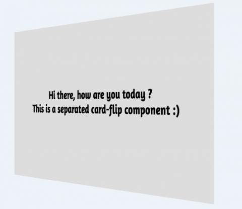

Finally we have the card from above. I will not add any HTML/Sass for this because you will find everything you need in codepen that I provided. We want to create here a flip card that has a image in front and some text on the back. Should we create a modifier or perhaps an entire new component? In this case we want to create a new component, there are to much changes, even in the markup, so we should leave the .c-card component and create for example a new .c-card-flip component that will have all the needed styles.
When you find yourself overriding too much from your initial component in order to make a modifier then it's time for an entire new component to be created.
Conclusion
Do I think BEM could solve any problem regarding CSS, no, but I think it solves a lot of them using this nice and clean(not at first you will think) modular approach. It helps on projects where more developers are involved. It helps when you are working on a big project that needs to be mentained for a long time after it's been finished. I know it helps me to create nice UI components in a modular way, not in a "page way". I encourage you to try this methodology, I encourage you not to settle for what you already know. Keep searching, keep learning. If you have any question, don't hesitate to ask in comments. I would love to hear your thoughts on this subject.