
Web Developer at ASSIST
The computing scientist’s main challenge is not to get confused by the complexities of his own making. - E. W. Dijkstra
Read time: 11 minutes
Introduction
When creating a web management application, many clients require pages which display statistics. Usually this feature comes along with the option to download the data in an Excel and/or PDF format. Therefore, this tutorial will show you how to create an Excel document and make it available for download in a Python/Django application.
Creating a working environment
First of all, when working with Django applications it is advised to create an environment (with virualenv) and install all the modules in that environment. This practice is very useful when you’re working on different websites that don’t use the same versions.
Speaking of modules, in this example we will be using:
- Python 2.7
- Django 1.8.2
- XlsxWriter 0.7.3
In order to expose the features brought by the XlsxWriter module, we created a simple Python/Django application, which is available for download on Github. It consists of saving weather data for multiple towns. The user can add towns and weather information through the Django Admin interface, which is generated automatically. The front page for this website displays the current weather for the available towns. Moreover, the site contains a page that presents the weather history data:
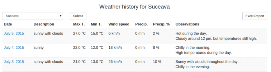
The user can filter the data by town, like in the above image, or select the default option which shows the history for all the towns. You can notice that there is an “Excel Report” button, hence, that is the button that will trigger the Excel file download.
How to serve a file for download
To begin with, in the HTML file there is a form that contains the “Excel Report” button. Therefore, in the corresponding Django view we receive the request to download ‘excel’. Thus, we have to send the file to the user and we can do this through the following code. The result is that the user receives a file named “Report.xlsx”:
if 'excel' in request.POST:
    response = HttpResponse(content_type='application/vnd.ms-excel')
    response['Content-Disposition'] = 'attachment; filename=Report.xlsx'
    xlsx_data = WriteToExcel(weather_period, town)
    response.write(xlsx_data)
    return response
The “WriteToExcel” function is responsible for creating the Excel file. It has two parameters:
- weather_period, that represents the data after the filtering, we will utilize it for writing information in the file;
- town, its default value is None and is used in case the user selects a town for filtering.
There are two options for writing the excel logic: either in the view or, like in this example, in a different file (named “excel_utils.py”). The second option offers a more clean and modular code.
How to create an Excel file
The next step is to add code to the “WriteToExcel” function and we will be doing that by using the XlsxWriter module. The following code will create a blank Excel file.
import StringIO
import xlsxwriter

def WriteToExcel(weather_data, town=None):
    output = StringIO.StringIO()
    workbook = xlsxwriter.Workbook(output)

    # Here we will adding the code to add data

    workbook.close()
    xlsx_data = output.getvalue()
    # xlsx_data contains the Excel file
    return xlsx_data
How to add title and headers
Before adding any actual data to the file, we can create a table in the Excel, which includes a title and some headers. The code associated with this implementation consists of:
- Adding a working Sheet:
worksheet_s = workbook.add_worksheet("Summary")
- Creating styles which can be used later when we will be adding the data. For example, we may want a bigger font size for the title, to make it to bold or we can add a color background for the headers:
title = workbook.add_format({
    'bold': True,
    'font_size': 14,
    'align': 'center',
    'valign': 'vcenter'
})
header = workbook.add_format({
    'bg_color': '#F7F7F7',
    'color': 'black',
    'align': 'center',
    'valign': 'top',
    'border': 1
})
- Adding a title that is written along more columns. In order to implement this you can use the merge_range function, along with serving the columns, the text and the title style already defined:
title_text = u"{0} {1}".format(ugettext("Weather History for"), town_text)
worksheet_s.merge_range('B2:H2', title_text, title)
- Adding the headers which actually means writing text to some cells:
worksheet_s.write(4, 0, ugettext("No"), header)
worksheet_s.write(4, 1, ugettext("Town"), header)
worksheet_s.write(4, 3, ugettext(u"Max T. (℃)"), header)
# the rest of the headers from the HTML file
Please note that the code in this article will use ugettext function when defining the texts. This is useful if you will add internationalization to the application. Moreover, keep in mind if you want to use unicode characters (such as “℃” or diacritical marks) you have to add u before the string and also define the encoding at the beginning of the file:
#!/usr/bin/python
# -*- coding: utf-8 -*-
The result for the code added up till now is:
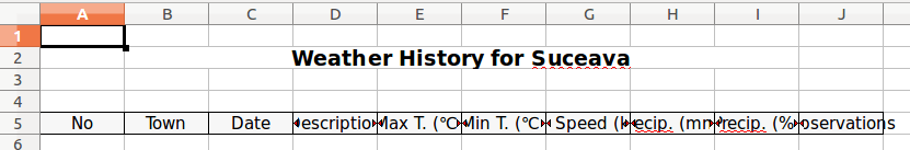
But there is a problem, some texts do not fit the columns, thus are not completely visible. The article will tackle this issue in the “How to resize rows and columns” section.
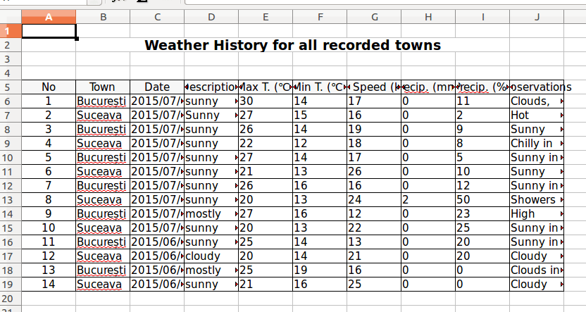
How to write data
After adding a new style for the cells, the data can be added through a simple loop which will write it to the corresponding columns:
for idx, data in enumerate(weather_data):
    row = 5 + idx
    worksheet_s.write_number(row, 0, idx + 1, cell_center)
    worksheet_s.write_string(row, 1, data.town.name, cell)
    worksheet_s.write(row, 2, data.date.strftime('%d/%m/%Y'), cell_center)
    # the rest of the data
In order to avoid creating an additional variable that would be incremented on each loop, we can use the python enumerate feature which automatically returns the index and the object from the list. You can observe that the idx variable is used for writing the value in the Number column. Furthermore, it is used to define a row variable, which along with a column value, determines where the data is written in the Excel file.
Following these modifications the file looks like:
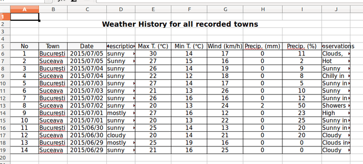
How to resize rows and columns
In previous sections, there was an issue with the width of the rows. This problem can have multiple solutions, depending on the desired results:
1. The columns can have a constant width. Suitable examples for this case are Date, Temperature, Wind and Precipitation columns. Thus, the code from below displays the change for Wind column. This line can be added after or even before the loop that adds the data.
worksheet_s.set_column('G:G', 10)
Adding this setting to all the columns that suit this solution, modifies the Excel file as follows:
2. The columns can adapt their width according to the data that they contain, in this instance: Town and Description. These values have a maximum length constraint in the database. Therefore, we can set a column width according to the biggest length of all the data:
description_col_width = 10
# ...
for idx, data in enumerate(weather_data):
    # ...
    worksheet_s.write_string(row, 3, data.description, cell)
    if len(data.description) > description_col_width:
        description_col_width = len(data.description)
    # ...
worksheet_s.set_column('D:D', description_col_width)
In this situation it is paramount to set the column options after the loop. Below is an image depicting how the Excel file changed:

3. The column can have a constant width, but the row height can vary. The last column, Observations, is where we can apply this condition. In this exercise, the width will be 25, meaning that we will consider that one row cannot have more than 25 characters:
observations_col_width = 25
# ...
for idx, data in enumerate(weather_data):
    # ...
    observations = data.observations.replace('\r', '')
    worksheet_s.write_string(row, 9, observations, cell)
    observations_rows = compute_rows(observations, observations_col_width)
    worksheet_s.set_row(row, 15 * observations_rows)
# ...
worksheet_s.set_column('J:J', observations_col_width)
You can notice that the number of rows is computed using a function, named “compute_rows” (its parameters are the text and the column width):
def compute_rows(text, width):
    if len(text) < width:
        return 1
    phrases = text.replace('\r', '').split('\n')

    rows = 0
    for phrase in phrases:
        if len(phrase) < width:
            rows = rows + 1
        else:
            words = phrase.split(' ')
            temp = ''
            for idx, word in enumerate(words):
                temp = temp + word + ' '
                # check if column width exceeded
                if len(temp) > width:
                    rows = rows + 1
                    temp = '' + word + ' '
                # check if it is not the last word
                if idx == len(words) - 1 and len(temp) > 0:
                    rows = rows + 1
    return rows
Now, the Excel file looks like:

As you can observe, there are cells that have extra rows. This happens due to the fact that the letters do not have the same width; so even though the number of characters exceeds the set maximum, the text fits in less than the expected space. This solution only simulates an Auto Fit option. As a result, some extra rows may appear when the text has a large number of characters.
How to add formulas
Formulas are very useful when presenting statistical data. For instance, in this example, we could compute averages or sums for the suitable columns. The following code implements the average for Max temperatures:
from django.db.models import Avg, Sum

def WriteToExcel(weather_data, town=None):
    # ...
    max_temp_avg = Weather.objects.all().aggregate(Avg('max_temperature'))
    worksheet_s.write_formula(
        row, 4, '=average({0}{1}:{0}{2})'.format('E', 6, row),
        cell_center, max_temp_avg['max_temperature__avg'])
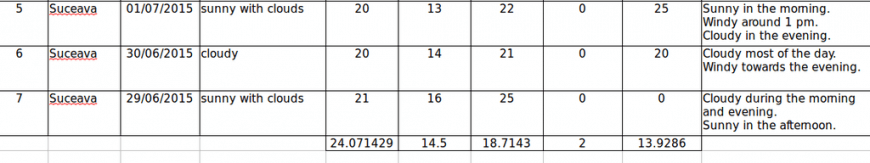
The formula is added using the write_formula functions which has 5 parameters, three of them are mandatory: row, column, a string defining the formula and the other two are optional: cell style and the computed value (it is useful to add this because when opening the file with an Excel Viewer it will display 0 instead of the expected result).
The file now has another row of data at the end of the table:
How to add charts
Prior to adding code regarding to the charts, we are going to add 2 new working sheets: one for the charts and one where we will be adding the data used for them:
worksheet_c = workbook.add_worksheet("Charts")
worksheet_d = workbook.add_worksheet("Chart Data")
Secondly, we require a purpose for each one of the charts.
Line charts
In this case, we could use a line chart in order to show temperature data for the towns along a certain amount of time.
First step is to add a chart object:
line_chart = workbook.add_chart({'type': 'line'})
Afterwards we have to add the data on the “Charts Data” sheet and read it in order to add series to the chart:
line_chart.add_series({
    'categories': '=Chart Data!$A1:$A${0}'.format(len(dates)),
    'values': '=Chart Data!${0}${1}:${0}${2}'
    .format(letter_max_t, 1, len(data)),
    'marker': {'type': 'square'},
    'name': u"{0} {1}".format(ugettext("Max T."), t.name)
})
The code from above can be written in a loop which would add this line for all the towns. Also, you can notice the fact that the values for categories and values will be read from the “Chart Data” sheet.
Further steps include:
- setting a title
line_chart.set_title({'name': ugettext("Maximum and Minimum Temperatures")})
- adding options for the x axis, for instance, the labels can contain strings instead of numbers:
line_chart.set_x_axis({
    'text_axis': True,
    'date_axis': False
})
- adding options for the y axis, for example, we can add measuring units for the temperature values:
line_chart.set_y_axis({
    'num_format': u'## ℃'
})
- including the chart on the “Charts” Sheet, where we have the option to change the scale. This can be considered as the last step.
worksheet_c.insert_chart('B2', line_chart, {'x_scale': 2, 'y_scale': 1})
The visible changes in the Excel files:
- a new sheet containing the chart

- a new sheet containing data

Column charts
In order to expose the usability of the column charts we are going to display the maximum and minimum value for wind speed for each of the available towns.
The workflow is identical to the previous chart, however, when creating the new chart object we have to change its type:
bar_chart = workbook.add_chart({'type': 'column'})
Next step is to make aggregations on the data, add it onto the data sheet and then create the series. For example the series for the maximum values is:
bar_chart.add_series({
    'name': 'Max Speed',
    'values': '=Chart Data!${0}${1}:${0}${2}'
    .format(chr(ord('A') + cell_index + 1), 1, len(towns)),
    'categories': '=Chart Data!${0}${1}:${0}${2}'
    .format(chr(ord('A') + cell_index), 1, len(towns)),
    'data_labels': {'value': True, 'num_format': u'#0 "km/h"'}
})
You can notice that we added some formatting to the data labels as well. After adding the title and inserting it into the charts sheet, we can observe the result:

Pie charts
This time, we will create a pie chart object, which present the percentage of hot, warm and cold days:
pie_chart = workbook.add_chart({'type': 'pie'})
Like in the previous examples, we have to aggregate the data, write it in the Excel and add the corresponding series:
pie_chart.add_series({
    'name': ugettext('Temperature statistics'),
    'values': '=Chart Data!${0}${1}:${0}${2}'
    .format(chr(ord('A') + cell_index), 1, 3),
    'categories': '=Chart Data!${0}${1}:${0}${2}'
    .format(chr(ord('A') + cell_index + 1), 1, 3),
    'data_labels': {'percentage': True}
})
The main difference from the other charts is that the values are automatically calculated as percentages.
After inserting the chart on the worksheet we have the following result:

Conclusions
In conclusion, when creating a Python/Django application that requires to export Excel files, XlsxWriter is a very useful module. You can access the official docs for this module where you will find further features and options to add.
Moreover, you can access the whole code for this application on Github. Hopefully it will help many developers learn how to export Excel files in a Python/Django properly.
In this article, the main subject was creating an Excel file in a Python/Django application. In a future article the attention will be drawn to PDF, another way to export data.
* The Excel files from the screenshots were opened with LibreOffice
UPDATE: In this article, the main subject was creating an Excel file in a Python/Django application. If you want to export PDF files check this article written by our colleague Petru.